Cisco Systems Inc
Branding/ Identity sytems
Brand Designer
I was brought on to help amplify ACE's sales enablement strategy. The team and its users expressed their desire to evolve ACE into a more refined brand and revamp its visual identity. Being the sole designer on the team, I was involved in end to end design process for each of these below mentioned design deliverables.
To develop a visual identity system for the ACE team that resonates with it's spirit and perception.
Visual Designer
Brand Asset management
UI Design
My first and foremost after joining the team was to redesign a logo that is simple and modern. The current team logo was dated and, did not reflect the sentiments of the users for ACE’s brand and voice. The redesigned logo is modern, clean and reflects the true essence of the ACE team.
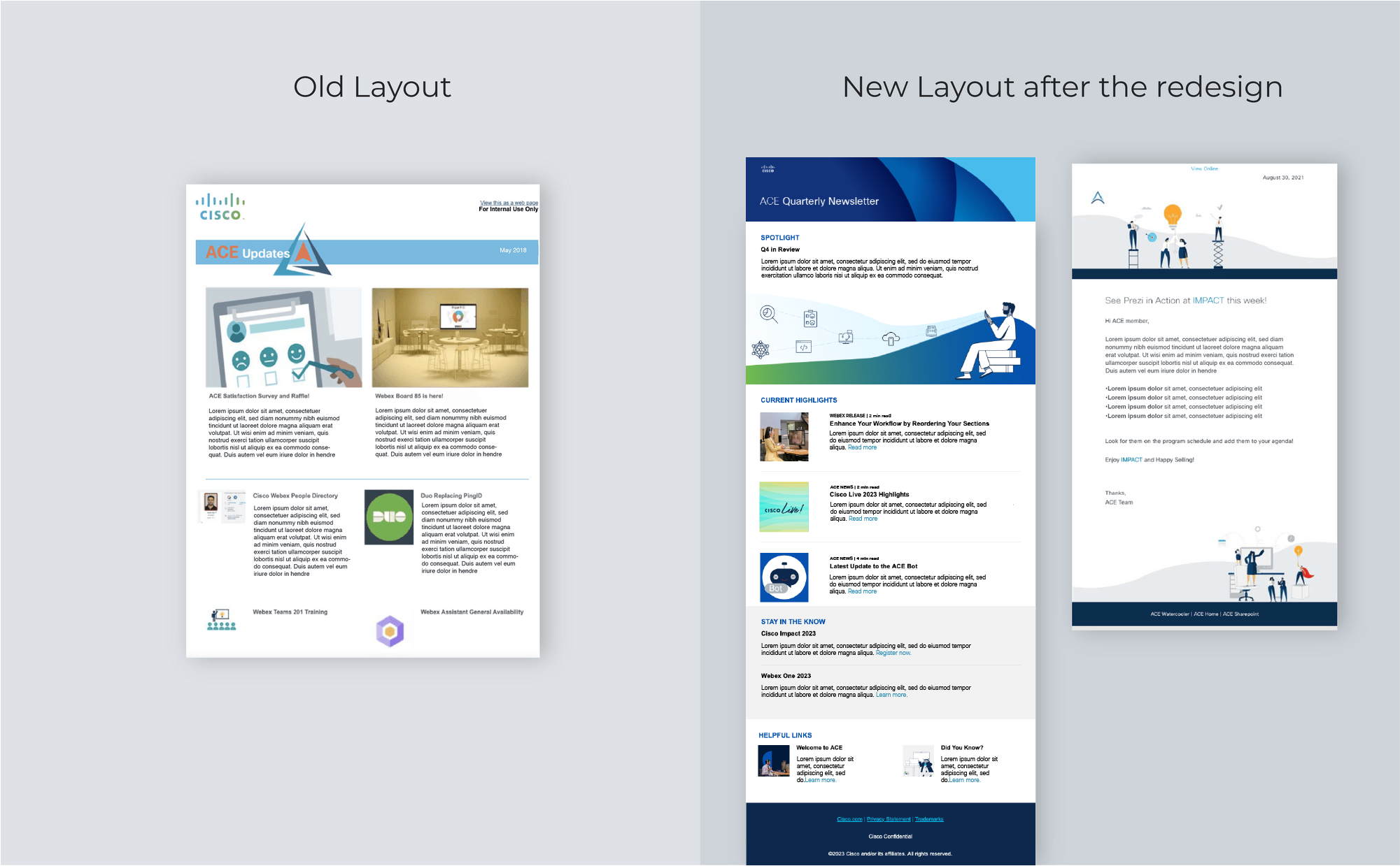
The new infographic template designed helped bring consistency in the communications across the touchpoints for ACE. The design enables clear information hierarchy through typography, layout and color blocking. It helps the users to navigate through the content easily. The use of brand colors and typography and helps reduce the cognitive load and create a sense of familiarity for the users.


Cisco is a leader in the collaboration tools. Video conferencing devices and applications are widely used for internal communications as well as for meetings with clients. These virtual backgrounds that I designed were inspired by a variety of themes such as Cisco Collaboration suite , and fun holidays.


Placed strategically at the top of ACE webpages, these banners serve a dual purpose: illustrating the page's content and providing users with a sense of location within the website, bridging the gap left by the absence of breadcrumbs in SharePoint.

The new design prioritizes user experience with clear readability, well-defined sections, and intuitive information organization. Additionally, icons and images enhance comprehension by providing visual context.
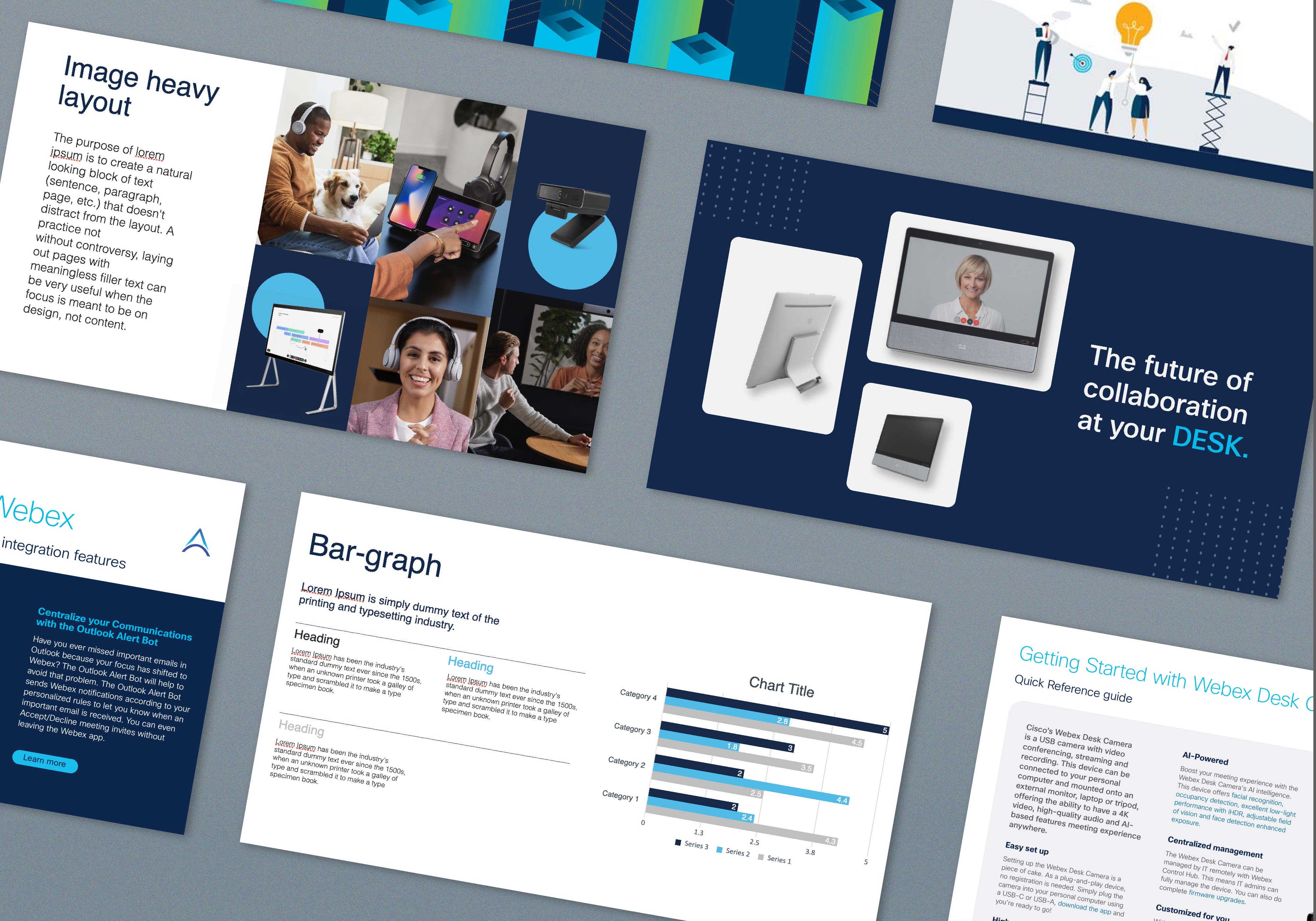
The new Powepoint template is clean modern and has variety of layouts to choose from.

ACE hosts and publishes a podcast every month for its users, I created the logo and intro video for the podcast.


