Cisco Systems Inc
UX, UI, Product Design
UX/UI Designer
User Researcher

ACE is a premium membership subscription that empowers the users with early access to Cisco’s Collaboration products.
ACE Launchpad is an application that enables sales users to order, register new devices and also avail support.
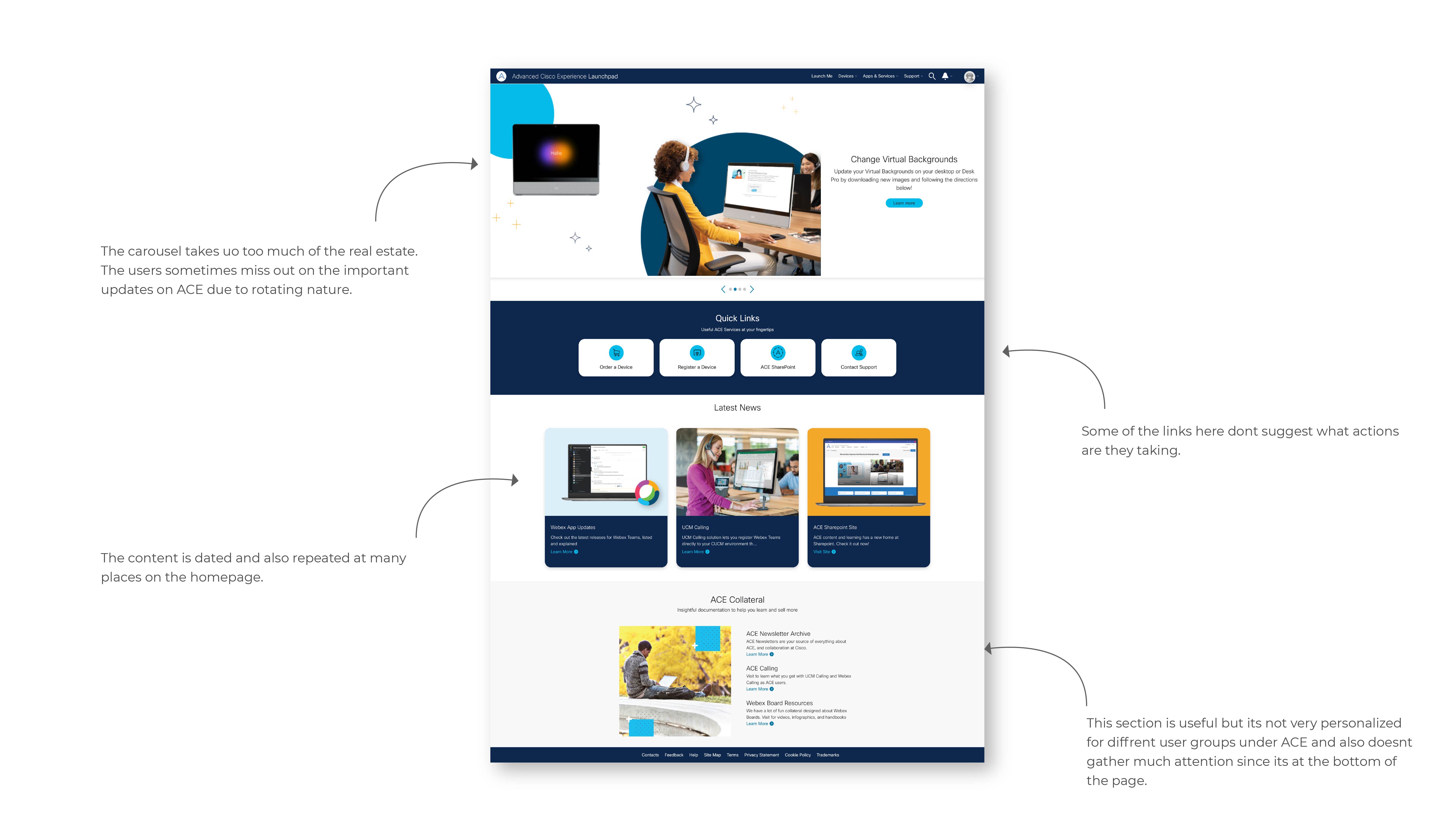
ACE users are frustrated with the current ACE Launchpad homepage because the content is not very organized. The information available is not engaging enough and also is not personalized. Some of the links dont really suggest where it leads them. The stories on the splash screen which is also a carousel, holds all of ACE's latest NEWS and events. This section is sometimes overlooked because of its rotating nature.
A homepage that enables the users to locate for information easily and is customized to the key user groups.
UX research, UI design, User Experience
Figma, Adobe Photoshop and Illustrator

Initial research focused on better understanding user’s needs related to finding information on the website and also why and when they interact with ALP.
How do the users learn about latest NEWS and updates for Cisco Collaboration products?
Does the navigation/layout of the content make sense for the users?
What are users current pain points with existing homepage?
What content is essential for ACE users on the ALP homepage?
User interviews were conducted to understand pain points of ACE Launchpad users.
A series of in-depth interviews were then conducted on 5 participants to further identify pain points, frustrations, needs, and desires with existing products to determine how ACE could improve this experience and fill the gaps


After conducting user interviews I started to gather some of the recurring themes in users responses and tried to investigate how it can be turned into product opportunities
The insights from the interviews was analyzed on how those can be converted into opportunities to engage the users in a meaningful way.
The content is stale and not updated often
It's difficult to locate information on the homepage
The information is not personalized to my subscription tier
Use color blocking to differentiate sections
Most of the information visible in one glance
Personalized content catering to ACE's different user groups
Two personas were built based on the user interviews to reflect on the user pain points and discover new opportunities that might exist in the ALP homepage experience.


To kick-off the design process, quick sketches helped me get ideas on paper to establish which elements were necessary for each screen. A low fidelity prototype was then created for initial user testing.
Created rough wireframes to get the ideas flowing and to quickly eliminate idea that aren't feasible.

Since the carousel/ hero banner is the first thing the users see and it holds all latest and greatest NEWS and updates from ACE, I wanted to explore the possibilities of how we can make it easy for the users to easily locate the information in one glance.

The resources section being very content heavy, I wanted to explore possibilities of presenting the information in a way that made the most sense to the user and made their experience a pleasant one.
After conducting a quick usability study, It was evident that the layout where the all the resources can be accessed at one glance was widely accepted.

Drawing inspiration from the insights we received from the user interviews, the final design was created considering ease of navigation, and easy discoverability of content.
All the components in the final designs and the color palate and typography was in alignment with the Cisco's UI kit.

The final designs have a strong structural hierarchy of information. This helps the users to navigate and find information easily. The color blocking helps the users to distinguish between the different sections on the homepage.

The information is presented to the users in way that is easily consumable
ACE has three different user group, the new design features content according to the user group making it personalized
The carousel was redesigned to feature all the stories at one glance which resulted in users not missing out on the latest NEWS and releases from Cisco collaboration
All the links in the quick links section gives a clear indication to the user what the proposed action is
The section are separated out by using color blocks which make it easy for the users to locate information
Simple hierarchal flow of information reduces the stress and confusion amongst the user and increases engagement